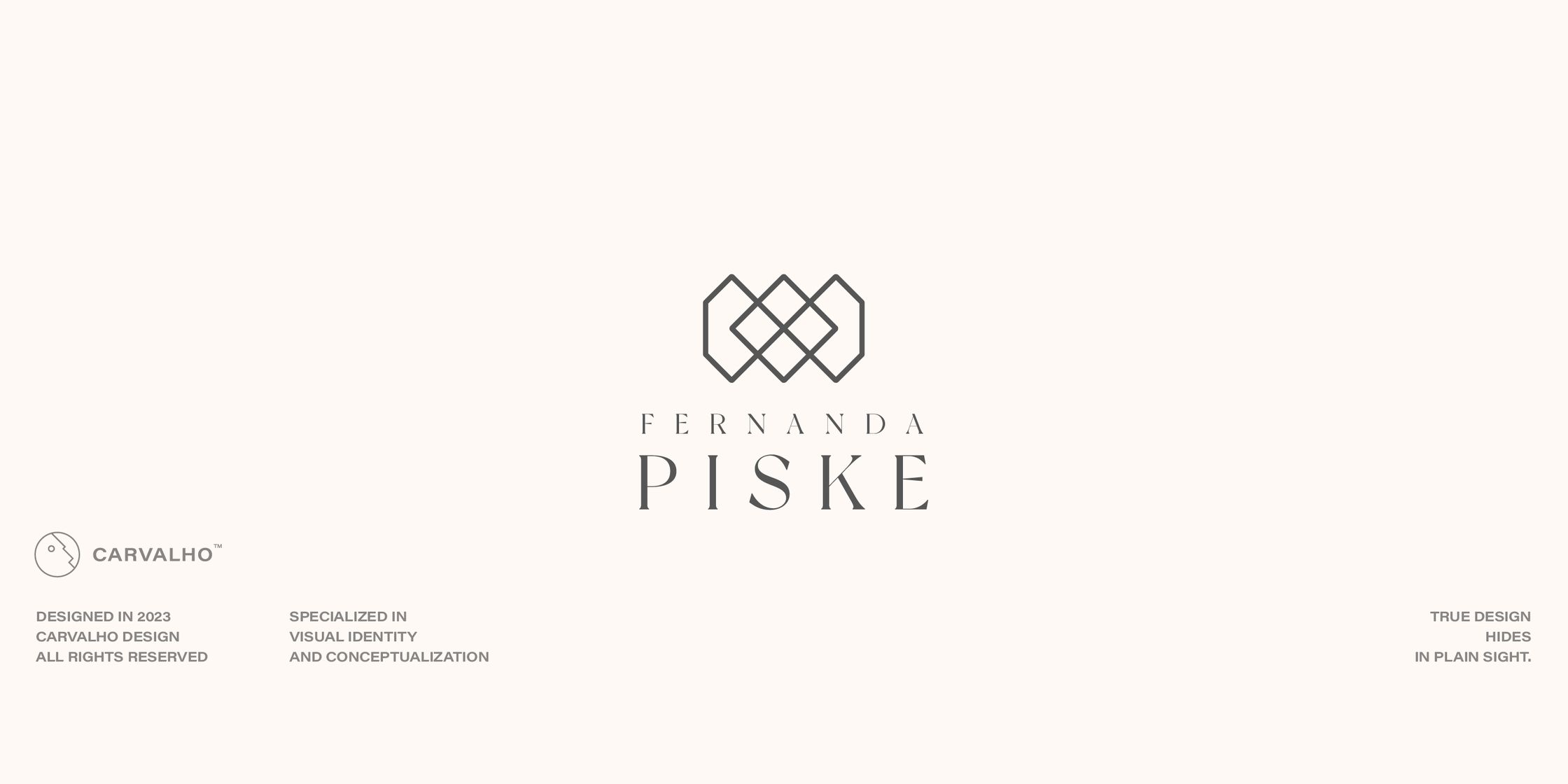
FERNANDA PISKE
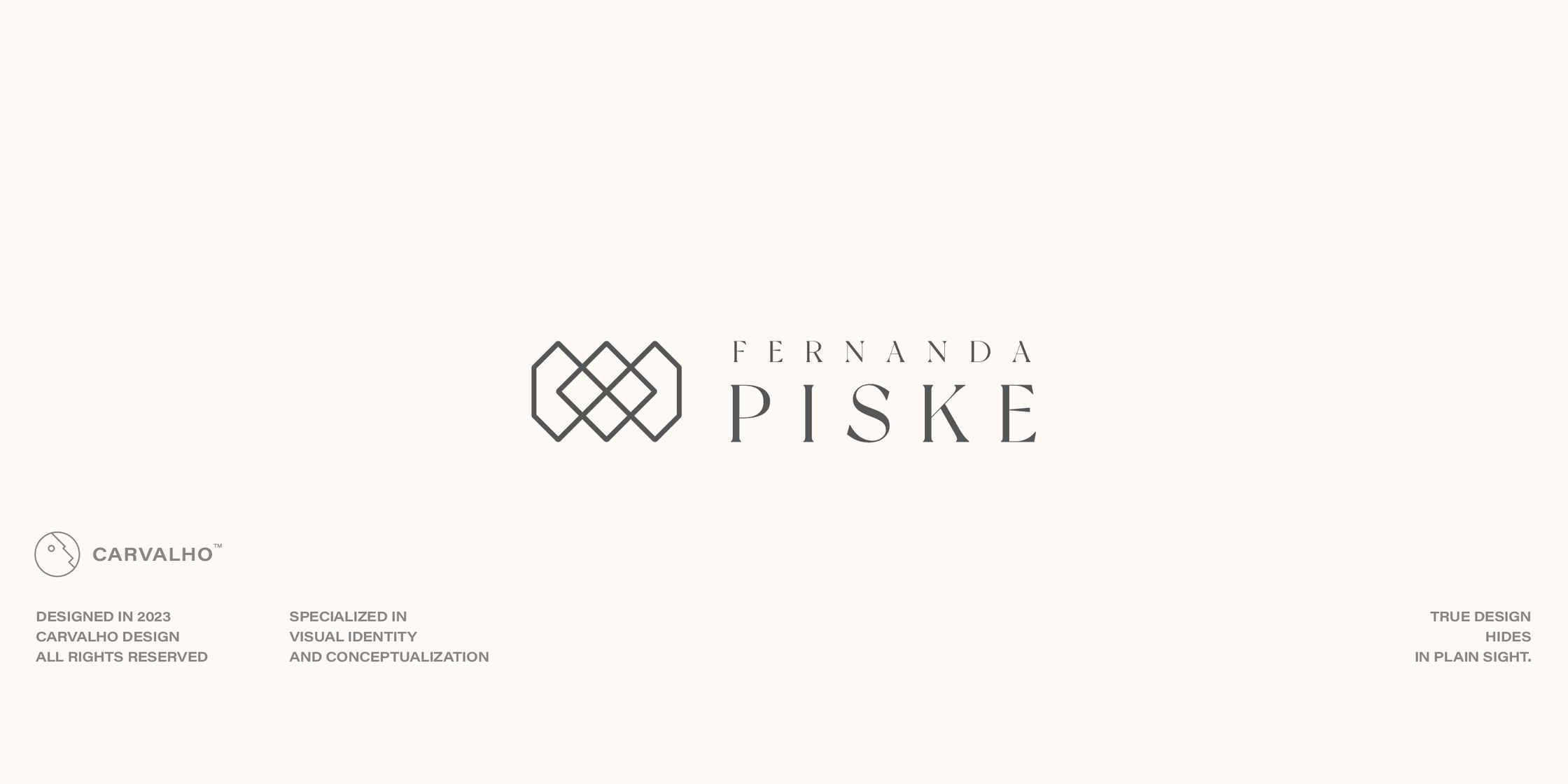
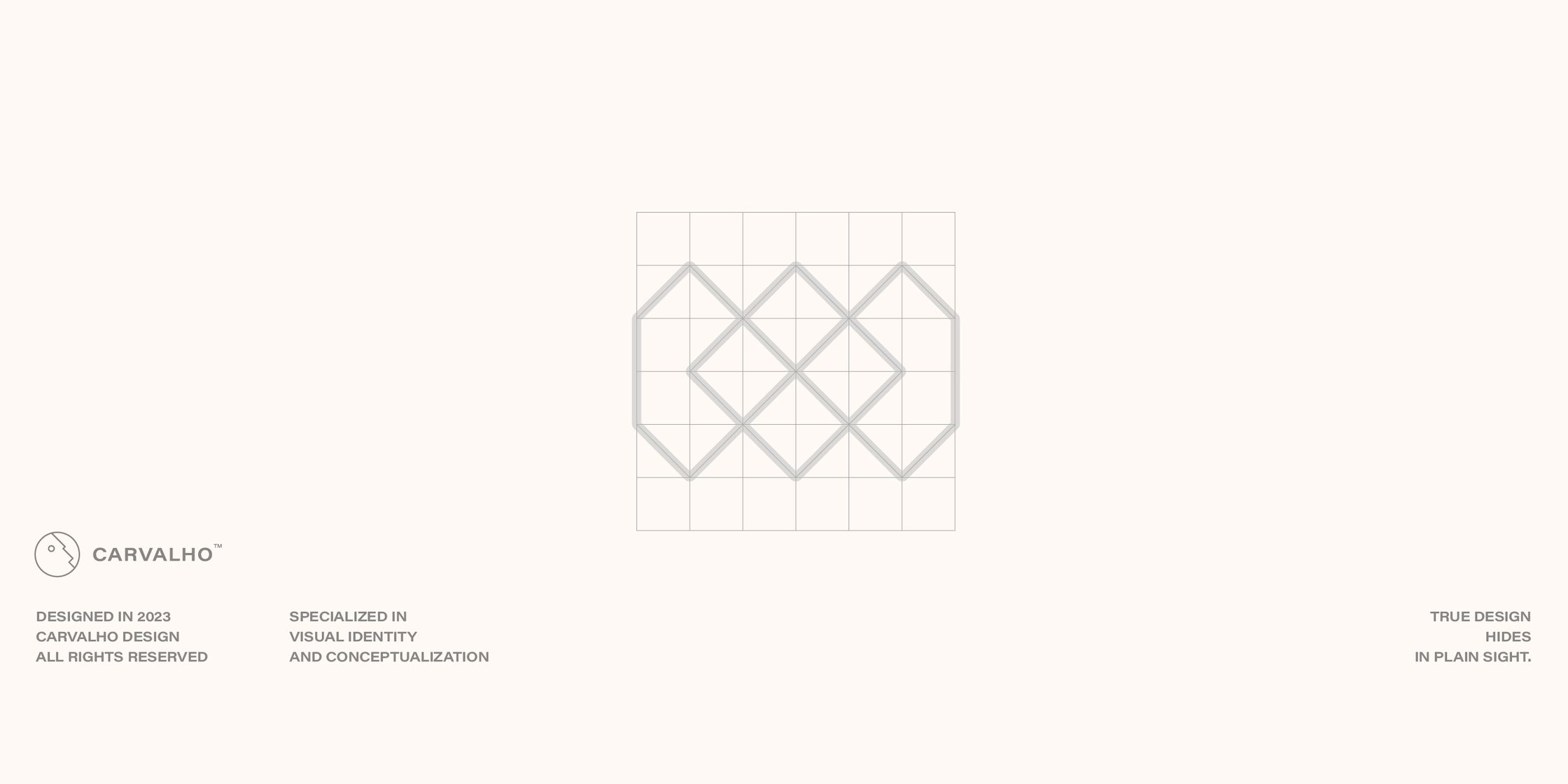
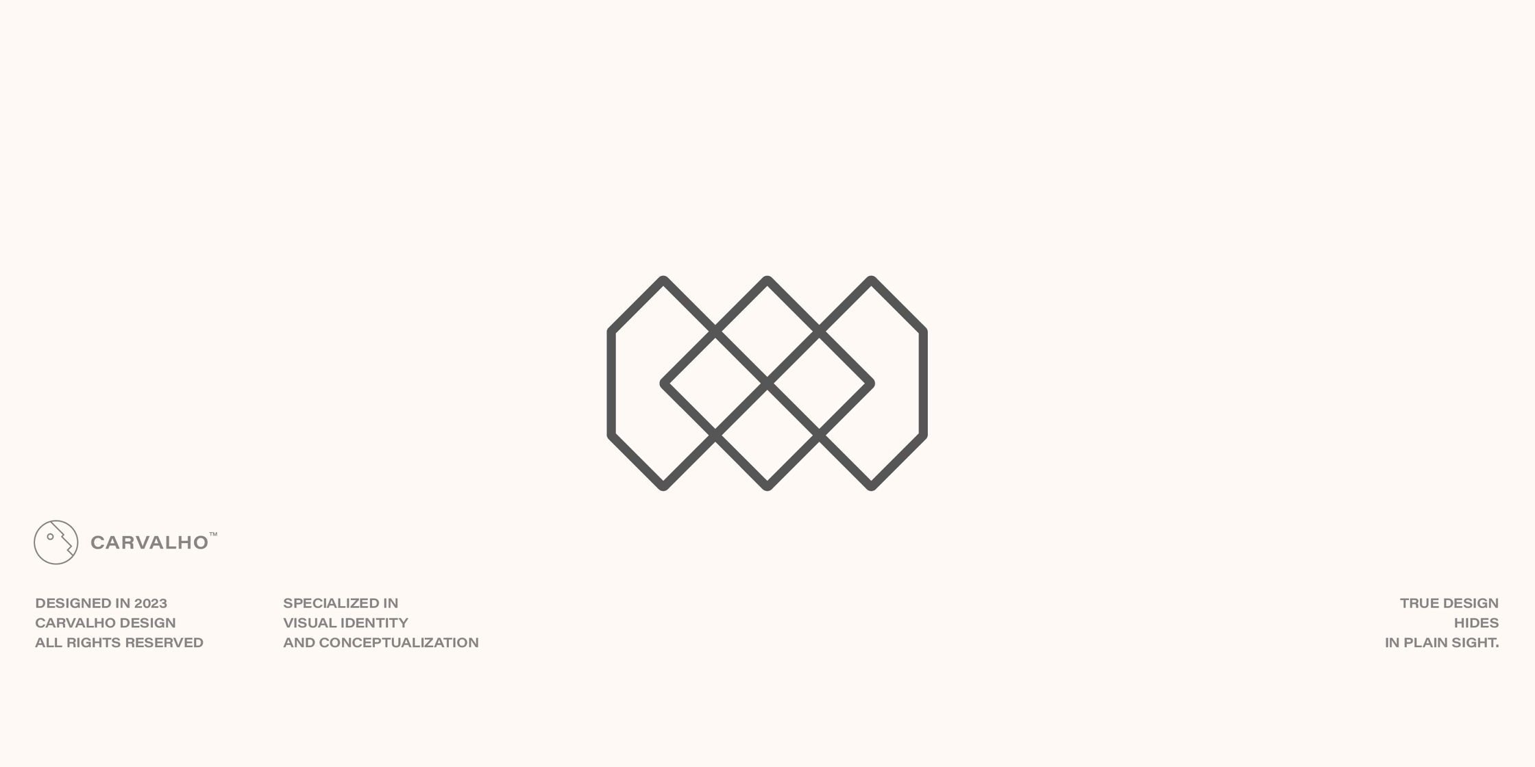
Fernanda's logo is a very, very simple one, and yet, one of the most beautiful, memorizable and elegant ones of my portfolio. I'm a firm believer in the beauty of the simple form. The beauty of abstraction, and the power of synthesis. This is a perfect expression of that idea.
The logo represents the process of creation of a cut stone. It represents the alchemy behind the very own idea of transmutation, of change of form. Not only change of form, but change of nature, if it might.

